
The Art of Van Life
The Art of Van Life is an editorial magazine from scratch. Tasked with creating a magazine with the requirements of “The Art of ___ “ theme, a table of contents, a half-page ad and a full page ad, I dove head first into a passion of mine. I dream about roadtripping the United States and photographing a National Park in every state.


The cover! With complete control over the design, I chose to create something unique. The ‘Van Life’ on the front cover has a drop shadow because it is a cut out of the cover.

This is where the cutout comes into play! Mercedes-Benz (aka me) created a full page ad where the topic is “Find your van”. With the van missing, the Mercedes is giving the consumer the perfect opportunity to get their perfect van.
Then we have the title, shown through the cut out, and tons of hand drawn vans that people travel cross-country in.
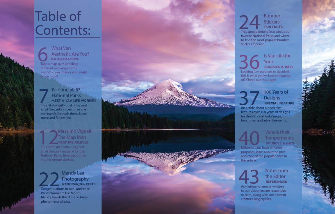
Table of Contents: Here we created the plan for all of the pages we had to create, a total of 16 pages.
All the colors used are drawn in from the image. This background image would rotate through with each edition.

With so many options to ride in, there’s also a ton of options on how to decorate the ride! This is a hand created map guiding people to the perfect vibe for them.
This is a single page report over a woman who is still traveling the country on the funds of her painting and social media career.

One of the requirements of the project was to do a two page spread over a personal report of a person that impacted the design world in correlation to your theme, so of course I chose the design magician Massimo Vignelli.
I created this spread with the intention of mimicking his iconic style and color palette he created for the national parks system to unify.

In the middle fold, I would do a reoccurring content spread of the Landscape Photo of the Month, highlighting photographers who travel the states with their camera.
On the left sits the image and on the right site a small column detailing information about the photographer, their career, anything special about the way they took the image.
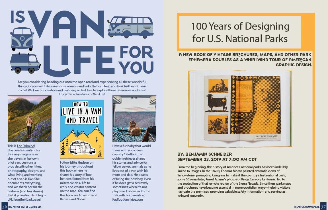
This single page spread is supposed to help encourage future van travelers to do their research and educate themselves on the trials and tribulations of van life.
This is the beginning of a three page report written by Benjamin Schneider over a book that details all of the old National Park designs.

This is the end of the report over the ‘100 Years of Design’ Book.
On the left is the half page ad. I chose to do it vertical so that I could stack the images the advert is selling. All of those images are also hand made and will be made in the future using woodblock printing.


To the left is the back cover of the magazine. To the right, there is the full spread of the magazine as it shift from the full image of a van on the road into a design wave - thusly creating the color palette for the editorial.